The account executive hangs up feeling good. The prospect nodded in all the right places, asked smart questions, even said, “This is really interesting.” Then three days pass. Then seven. No reply. No next step. No deal.
This pattern is more structural than it looks. According to Gartner, 77% of B2B buyers say their last purchase was very complex or difficult to navigate - and the demo is often where that complexity compounds rather than resolves. Most demos are built to impress in the moment. The problem is that the moment ends. The call finishes, the presenter disappears, and the buyer is left to reconstruct the value argument alone, in an internal meeting, with fragments of what they half-remember.
A product demo that sells itself does something different. It communicates value in a controlled sequence so clearly that the buyer understands why it matters without needing anyone in the room to explain it.
01 - Why Most Demos Fail
Most demo failures don’t come from weak products. They come from weak sequencing. If you’re still relying on static screenshots instead of interactive demos, that’s a separate problem — this post assumes you’re building the interactive version and focuses on getting the architecture right.
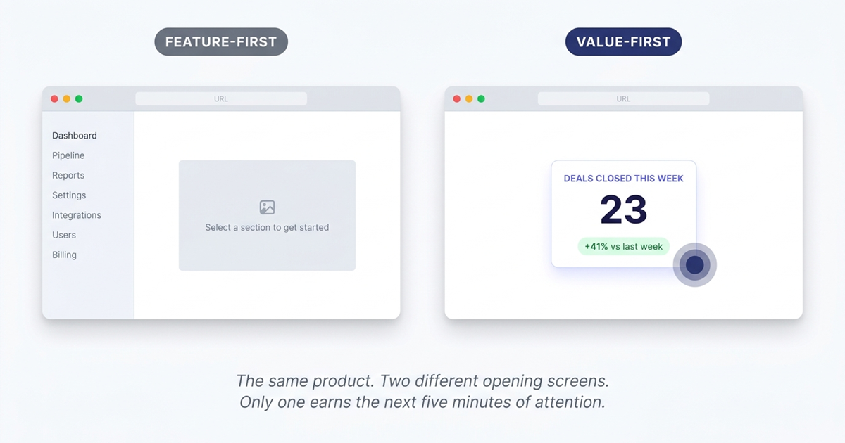
The first problem is starting with the wrong material. Teams open on navigation, menus, settings, dashboard tabs - the structural parts of the product rather than the valuable parts. This is understandable. The interface feels like necessary context to someone who knows the product. To a buyer who doesn’t, it feels like work they haven’t yet agreed to do.
The second problem is diffusion of focus. In a live call, you can recover by talking over distractions - “ignore that for now,” “I’ll come back to that.” But once the demo becomes something the buyer revisits alone - forwarded to a director, shared in a Slack thread, linked from a follow-up email - the live narration is gone. The structure collapses. They click randomly. They leave with fragments instead of conviction.
The third problem is credibility. Empty states, toy data, and generic placeholders make a product feel less real than it is. Research on the IKEA effect shows that people assign more value to environments they can see themselves inhabiting — and a demo environment that looks staged short-circuits that process immediately. The buyer stops imagining their own business inside the product and starts evaluating the presentation instead.
A product demo converts when it reduces the buyer’s imagination load. They should not have to interpret. They should see the value path immediately.
02 - How to Create a Product Demo That Actually Converts
If you want to know how to create a product demo that sells, start with this principle: don’t explain the product in the order it was built. Explain it in the order value is understood.
That usually means reversing the instinct most teams have. Instead of beginning at the top of the workflow, begin at the point of payoff. Instead of touring features, isolate the one moment that makes a buyer think, “Yes, this would help us.” Instead of treating the demo like a product overview, treat it like a guided decision.
A strong demo does four things well. It leads with the aha moment. It controls attention. It feels credible. And it ends with one unmissable next step. Everything else is secondary.
03 - Lead With the Aha Moment, Not the Feature List
Every product has a moment where the value becomes undeniable. For some tools, it’s a report that surfaces a problem instantly. For others, it’s an automated action that replaces a tedious manual task. For others still, it’s the speed of reaching an answer that normally takes thirty minutes and three spreadsheets.
That is where your demo should begin.
The common mistake is assuming buyers need orientation before they can appreciate the outcome. In practice, the opposite is true. Once a buyer sees the outcome, they become willing to learn how it works. Before that, they are simply being walked through software.
A useful diagnostic: ask what is the single screen, interaction, or result that makes the product feel worth buying? Not “what is the core feature set?” Not “what does onboarding look like?” The moment. The answer is almost always narrower than teams expect.
Build the opening around that. Show the resolved pain first. Show the thing that compresses time, reduces effort, or makes risk visible. Once that lands, move backward and explain the mechanism.
This produces an immediate shift in buyer attention. They stop asking, “What am I looking at?” and start asking, “How soon could we use this?” - and that shift needs to happen in the first few minutes, before attention decay sets in.
03.5 - Bad Demo Opening vs. Good Demo Opening
The difference between a demo that converts and one that doesn’t is often visible in the first 30 seconds. Here is what that contrast looks like in practice:
| Bad demo opening | Good demo opening | |
|---|---|---|
| First screen shown | Login page, empty dashboard, or navigation menu | The output — a resolved problem, a generated report, a completed workflow |
| First thing said/shown | ”Let me give you a quick overview of the interface…" | "Here’s the moment your team gets back two hours every Tuesday.” |
| Data in the demo | Generic names, round numbers, empty states | Realistic names, plausible activity patterns, minor irregularities |
| Buyer’s mental state | ”What am I looking at? How does this relate to my problem?" | "I see the value. How does this actually work?” |
| Attention at minute 3 | Declining — still in setup and orientation | Peaked — buyer is already asking follow-up questions |
04 - Use Guided Hotspots to Control Attention
A product demo should not feel chaotic. It should feel inevitable.
When buyers explore a product on their own, they rarely follow the path you would choose. They click wherever their eye lands, chase secondary details, and get curious about the wrong thing at the wrong time. This is one of the main reasons demos lose force the moment the presenter disappears.
Guided hotspots solve this by narrowing attention without making the experience feel constrained. Instead of asking the viewer to decide where value lives, you direct them to it. One click. One focus area. One next move.
The best guidance is light but precise. A hotspot pulls attention toward an action that matters. A tooltip explains why that action matters. Step progression maintains narrative momentum. This is not decoration - it is sequence control. You are shaping the order in which the buyer forms conclusions.
That matters because software is almost never self-evident on first contact. Even products with elegant interfaces still require emphasis. The viewer needs to know where to look, what to ignore, and what conclusion to draw from what they just saw.
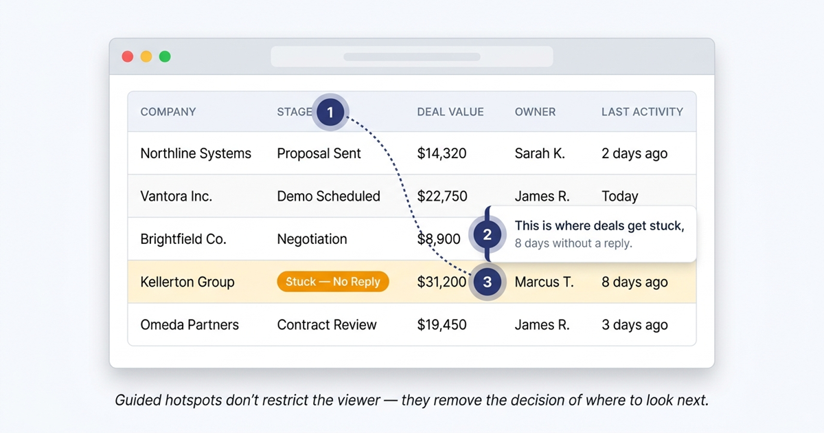
A good rule: each step should answer one buyer question clearly. If one screen tries to explain three things at once, it is doing too much. Break it apart. Let the demo breathe.
05 - Make the Demo Feel Real With Credible Data
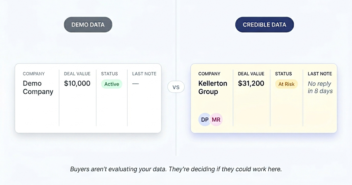
Nothing undermines a product demo faster than demo-looking data.
The buyer may not say it aloud, but they notice immediately. The names look fabricated. The dashboard is too clean. The numbers are round and perfect. The workflows have no friction. Instead of feeling like a tool used by real teams, the product starts to feel staged.
This matters because trust is fragile during software evaluation. Buyers have seen polished presentations before. What they are actually looking for is evidence that the product can handle the messiness of real work.
The fix is environmental. Use data that resembles the buyer’s world: plausible names, realistic activity patterns, edge cases, minor irregularities that suggest ongoing use rather than a configured showcase. Let the product look inhabited.
This does more than improve aesthetics. It reduces the mental distance between “interesting software” and “something we could actually use.” The buyer stops translating abstract examples into their own environment because the translation has already been done for them.
Realistic data also sharpens the story. If you are demonstrating a reporting workflow, show operational numbers that resemble a live business. If you are showing collaboration, show users, updates, and history that suggest real ongoing activity. If your value rests on automation, show inputs and outputs that reflect a working process rather than a clean lab environment.
Credibility is not a cosmetic layer added at the end. It is part of the conversion mechanism.
06 - End With One Clear CTA
Most demos end too softly — and this problem gets worse when the demo lives behind a gated demo request form where the rep has to follow up manually anyway.
The buyer reaches the end and is left with options instead of direction. Book a call. Start a trial. Visit pricing. Contact sales. Watch another demo. Read more. The result is hesitation dressed up as choice. Every additional option introduces friction - and at the end of a demo, friction is the last thing you want.
A better ending does one thing: it tells the buyer what comes next.
That next step should match the intent you just created. If the demo is top-of-funnel, the CTA may be to book a tailored walkthrough. If the product supports self-serve onboarding, it may be to start a trial. If the viewer is clearly mid-funnel, the CTA may be to see the product with their own data. But it should be one next step, not four.
A good demo close feels like continuation, not a sales ask. The viewer should feel that clicking through is simply the next logical action after understanding the value - not the moment where the demo hands them to a sales funnel.
06.5 - Product Demo Template: The 6-Step Build Checklist
Use this checklist before you build any interactive product demo. Each step maps to a structural requirement — skipping one is how demos end up impressive in the room and forgettable afterward.
Define your audience. Which persona is this demo for? What is their primary pain? What does success look like in their language? A demo built for “everyone” converts no one.
Pick one workflow. Not the full product — one workflow that produces the most undeniable value for that persona. The narrower the scope, the stronger the impact.
Start at the aha moment. Identify the single screen or interaction where the value becomes undeniable. Open there. Do not start at login, the dashboard, or step one of onboarding.
Guide the path tightly. Use hotspots and tooltips to control the sequence. Each step should answer exactly one buyer question. If a step is doing more than that, split it.
Use believable data. Populate the demo with plausible names, realistic numbers, and minor irregularities. The data should look like a live system — not a staged showcase.
End with one CTA. Not “Book a Call / Start a Trial / Learn More.” One. Make it match the intent the demo just created. Then stop.
07 - Best Interactive Product Demo Software
The framework above requires the right tooling to execute. Here is how the main categories of interactive product demo software compare — and where each fits in the build process described above.
| Approach | How it works | Strengths | Trade-offs | Best for |
|---|---|---|---|---|
| No-code screenshot capture (first-generation platforms) | Records screen as images, overlays interactive elements | Fast to produce, no engineering required | Lower fidelity — synthetic feel, doesn’t update with product | Teams needing a quick proof of concept |
| Custom engineering builds | Engineers build a demo environment from scratch | Maximum fidelity and control | Weeks of effort, expensive, hard to maintain | Large enterprises with dedicated demo engineering |
| HTML-based demo platforms (e.g., SwiftDemos) | Chrome extension captures live product as editable HTML; add hotspots and analytics on top | Real product fidelity, no engineering required, fast to update, fully indexed by search engines | Requires access to a working product to capture | Teams that want full fidelity without a dev sprint |
The key differentiator with HTML-based capture is that the demo source is your real product markup — not a screenshot overlay. This matters for the framework above: when you edit hotspot text or swap out data, you’re editing the real interface, not a layer on top of a frozen image. Updates that take a day in other tools take minutes here.
08 - Where SwiftDemos Fits In
The framework above requires the right raw material - and most teams don’t have it.
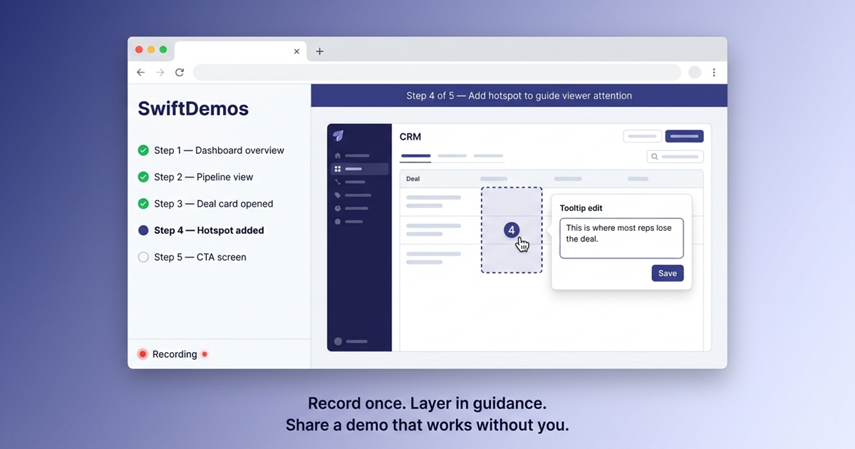
A video is easy to record but impossible to guide after the fact. A slide deck is easy to sequence but not interactive. A live sandbox feels real but is difficult to control. SwiftDemos sits at that intersection: record a live product walkthrough via the Chrome extension, then turn it into an interactive HTML demo with guided hotspots and tooltips layered on top.
That structure directly enables what the framework describes. You can open on the right screen instead of the default dashboard. You can add hotspots so the viewer moves through the experience in the intended sequence. You can attach context to each action with guided tooltips rather than forcing explanation into a separate email or follow-up call. And because the source comes from the live product rather than a rebuilt mockup, realism is preserved rather than reconstructed.
The important distinction is this: a SwiftDemos demo is not a recorded video or a static screenshot tour. The buyer moves through a controlled, interactive version of the real product - which is what the framework requires.
Coda - The Demo Should Still Work After You’re Gone
If your demos feel strong in the room but weak afterward, the problem is not your presenting skill. It is the demo’s architecture.
The question for sales teams isn’t whether to build better demos, but how quickly they can make that shift before the window closes. Interactive, self-guiding product experiences are still early enough to be a differentiator - but that gap is narrowing. Teams that build demo infrastructure now convert the same pipeline with less effort. Teams that wait rebuild from scratch at higher cost and higher competitive pressure.
The fix is structural, not cosmetic. Start at the moment of value. Guide attention tightly. Use data that feels real. End with one clear next step. Build the experience so it communicates the same conclusion when nobody is there to explain it.
FAQ - Common Questions
What makes a product demo convert rather than just impress?
A demo that converts communicates value in a controlled sequence that the buyer can follow alone - without a presenter to explain it. The key elements are: starting at the moment of maximum value rather than the beginning of the workflow, using guided navigation to control the order in which the buyer forms conclusions, and using realistic data so the buyer can picture their own business inside the product.
How long should a product demo be?
Long enough to establish value and short enough to maintain attention. For an interactive self-serve demo, aim for five to eight guided steps that cover the aha moment, two or three supporting proof points, and a clear CTA. Longer is rarely better - diffusion of focus is one of the most common reasons demos fail to convert.
What is the aha moment in a product demo?
The aha moment is the single screen, interaction, or result that makes the product feel worth buying. It is usually narrower than teams expect - often one specific outcome that compresses time, reduces effort, or surfaces a problem the buyer didn’t know they could see. Building the demo to open on that moment, rather than treating it as a destination, is the most effective structural change most teams can make.
How do guided hotspots improve demo conversion?
Guided hotspots control the order in which a buyer forms conclusions about the product. Without them, buyers click wherever their attention lands - which rarely matches the intended value path. With them, each interaction moves the buyer to the next relevant moment without requiring a presenter. This is especially important for demos that are shared, forwarded, or revisited after the initial call.
What data should I use in a product demo?
Use data that resembles the buyer’s operating environment: plausible names, realistic numbers, minor irregularities that suggest ongoing use. The goal is to reduce the mental distance between “interesting software” and “something we could actually use.” Demo-looking data - perfect numbers, empty states, generic placeholders - signals that the environment is staged, which undermines the trust the demo is trying to build.
Gartner statistic reflects the 2023 B2B Buying Journey Survey. IKEA effect research cited from Norton, Mochon, and Ariely (2012). Individual demo performance varies by product category, target market, and implementation quality.
Build interactive demos that close deals.
No engineering team required. Go from Chrome capture to a shareable, trackable demo in minutes.